Two weeks ago we talked about the eight wastes and using a waste walk to identify them in your organization. As a review, your rapid improvement team members go on a waste walk, capture the wastes they observe, and placed them on a DOWNTIME chart. Then they brainstorm solutions to eliminate the waste. A great tool to show transportation and motion is a spaghetti diagram.
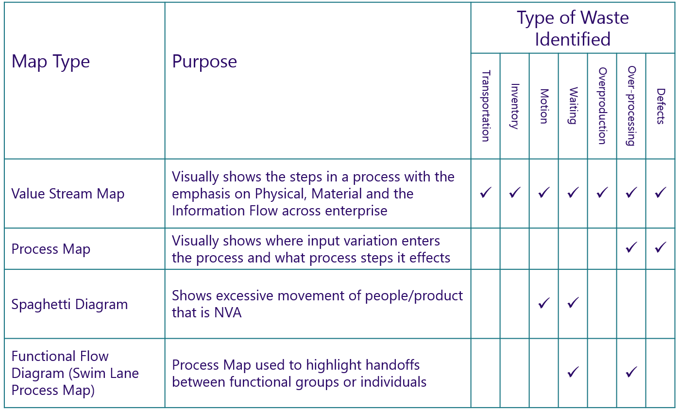
I’m assuming you started with a Value Stream Map to identify the best options for improving your business. VSM’s are designed to show all eight types of waste at a high level.
When you are in the middle of a Rapid Improvement Event, you might want to know how much motion or travel occurs with a current state layout and quantify the motion.
As we can see from the chart, a great tool to do that is a spaghetti diagram. It gets its name because when you track the motion of your employees it looks like a bowl of spaghetti.
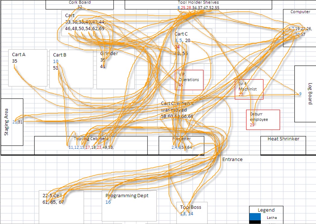
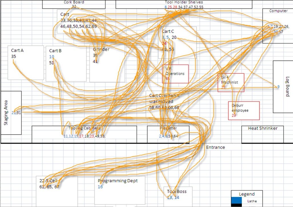
This is an example from a machine shop that I consulted with in 2007. You can see their set-up person traveled all over the shop to get a job ready for setup.
What do you learn from a spaghetti diagram?
The efficiency of the current state layout
As you can see from the spaghetti diagram above, the setup person traveled from the tooling cabinet on one side of the shop to the tool holder shelves on the other side of the shop regularly. When looking at it visually, it makes little sense to do that.
The visual representation provides the information to make better layout decisions.
How far something travels
I suggest you purchase a distance wheel and measure how far the part or person travels through the current state layout. You can get a small distance wheel at Home Depot or Lowes for about $25. Using that tool and following the path of travel, you’ll be able to calculate how far a part travels.
I did this with a company in California and their part- about the size of a computer mouse traveled 3500 feet before they completed it. That’s over ½ a mile. They had opportunities for a better layout.
Leads to natural future state options
When you see how the current state layout performs, it makes it easy to develop an improved future state layout. In the example above, the tooling cabinet and the tool holders should be next to each other. It’s easy to see from our spaghetti diagram.
If you make the changes during your RIE, then you can develop a before and after spaghetti diagram and capture the savings for your report out. Not to mention the ongoing benefits of an improved layout. Your employees will thank you when they go home at the end of the day less tired!
As always, it is an honor to serve you, and I hope that you and your company are getting better every day!
Follow me on Twitter
Join me on LinkedIn
Listen to the podcast here